So it’s that time again to look at your spreadsheet export you may have pulled from a database or received in an email. Let’s say you ran your weekly export, opened the spreadsheet in Microsoft Excel or Google Sheets, and now have too many columns to count and endless rows on a huge grid. You’re wondering how you can see what you actually need rather than deleting everything you don’t and trying to hide columns. If that’s happened to you, keep reading! I’d like to introduce the pivot table. This is a quick and easy way to group your rows and columns to narrow down the information you receive after exporting any spreadsheet, time card or payroll document.
Follow these quick steps, get your numbers, and move on. This works with any set of data you export to a spreadsheet from any system, as long as there are no totals listed within the sheet. If there are totals, it will throw off your groupings and potentially count numbers more than once.
Paid Time Off (PTO) Sample Business Case Example and Instructions
Let’s say you are having trouble with staffing during business hours. It seems like employees are taking too much paid time off (PTO). You or your boss want to know exactly how many hours each employee used in sick and personal time over a period of time so you can either address it with them or, if it’s not time off that’s the issue, then figure out another solution.
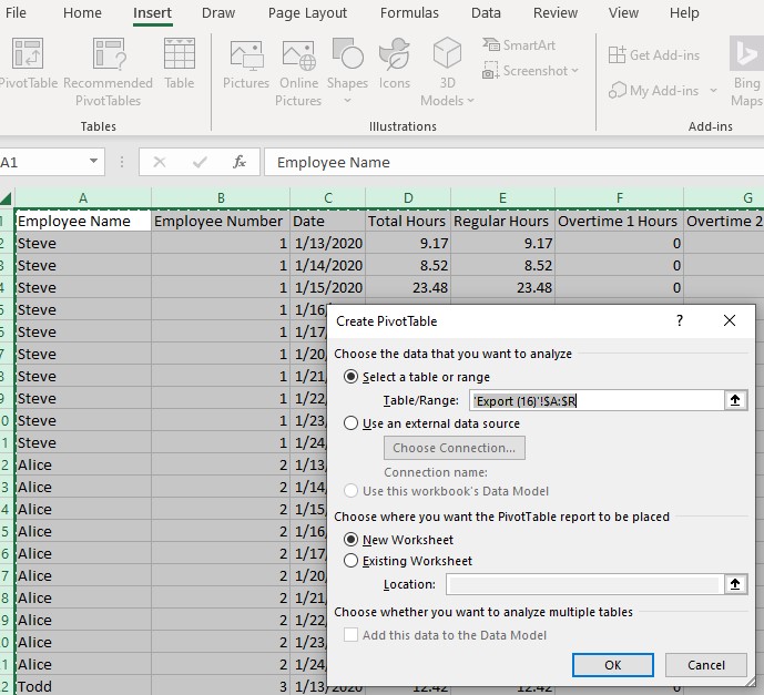
- To start your pivot table, we are going to highlight all of the rows and columns to capture all of the data. Open your file and select all of the columns and rows. Note there are links under each set of instructions if you would like to follow along with a sample spreadsheet. In Excel or Sheets, you can do this by clicking on the upper left rectangle, Excel has a triangle, between column “A” and row “1”. Note that by selecting all of the data, you will end up with “(blank)” listed in your pivot along with the employee names, but that’s okay, it’s taking into account the empty cells at the bottom of the report. If you selected only cells with data in them, you would avoid this. If you later end up adding data, you may forget to reselect all of the cells and columns plus the new ones, so it can be safer to highlight the entire sheet, up to you.
Now from here, there are slight variances between Excel and Sheets so I will go through Excel first, then Sheets below.
Pivot Tables Using Microsoft Excel
Click here for the Microsoft Excel sample spreadsheet.
- Click on “Insert” at the top bar.
- Select “Pivot Table.”
- There’s lot of options that will appear. It’s usually always safe to go with the default and click “OK”. This will add a new sheet for your pivot table. You may add to existing but that tends to get messy to see both your columns and rows and a pivot.
- I like to rename the tab on the new worksheet to something meaningful so I remember the purpose. Let’s call it “Days Off”. Right click the tab and choose “Rename.” Do the same and name the export tab to “Time Cards Ending Fillinyourdate”.
- Off to the right, you will see “PivotTable Fields”. This is where all of those endless column names ended up. If it disappears on you, click anywhere on the table you started and it will show up again.
- Choose the items you want to focus on and put them in the “Rows” box by dragging and dropping. In this example, we need the information displayed by the employee, so click on “Employee Name” and drag it to the “Rows” box.
- Now, we want a number of days sick, so that goes under “Values”. “Values” = a numerical answer, so drag “Sick (PTO)” to the “Values” box. You also want personal days taken, so click on “Personal (PTO)” and put that in “Values.” My export uses these names, yours can be any you or your business have chosen.
- Excel will likely default to “Sum”, which is adding the total of the “Sick (PTO)” hours by employee. If it doesn’t, click on that field and choose “Value Field Settings” and choose “Sum”.
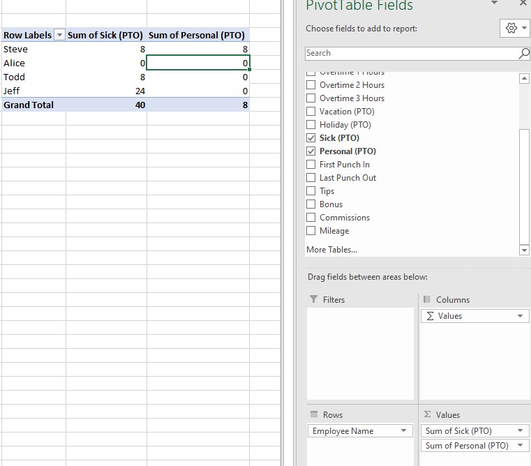
The Excel Results
You did it using Microsoft Excel! You can quickly see now that Steve used 8 hours of sick time and 8 hours of personal over the period. Todd used 8 sick hours, and Jeff used 24 sick hours. The entire team used 40 hours of “Sick (PTO)” and 8 hours of “Personal (PTO)” over the two week pay period. No wonder it seems like staffing is an issue lately!
Next Steps
Try moving additional headings to “Rows” and “Values” to see what other types of useful reports you can generate. Or, repeat the steps using other fields to have multiple different reports in one file.
Pivot Tables Using Google Sheets
Click here for the Google Sheets sample spreadsheet.
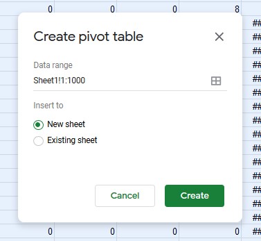
- You’ve already highlighted the sheet from step 1 above, so click on “Data” at the top bar.
- Select “Pivot Table.”
- Leave it on “New Sheet” and click “Create.”
- I like to rename the tab on the new sheet to something meaningful so I remember the purpose. Let’s call it “Days Off”. Right click the tab and choose “Rename.” Do the same and name the export tab to “Time Cards Ending Fillinyourdate”.
- Off to the right, you will see “Pivot table editor”. This is where all of those endless column names ended up. If it disappears on you, click anywhere on the table you started and it will show up again.
- Choose the items you want to focus on and put them in the “Rows” box by clicking “Add” and selecting the item. In this example, we need the information displayed by the employee, so click “Add” and select “Employee Name”.
- Now, we want a number of days sick, so that goes under “Values”. “Values” = a numerical answer, so click “Add”, then “Sick (PTO)”. You also want personal days taken, so do the same for “Personal (PTO)”. My export uses these names, yours can be any you or your business have chosen.
- Google Sheets will likely default to “Sum”, which is adding the total of the “Sick (PTO)” hours by employee. If it doesn’t, click on that field “Summarize by” and select “Sum”.
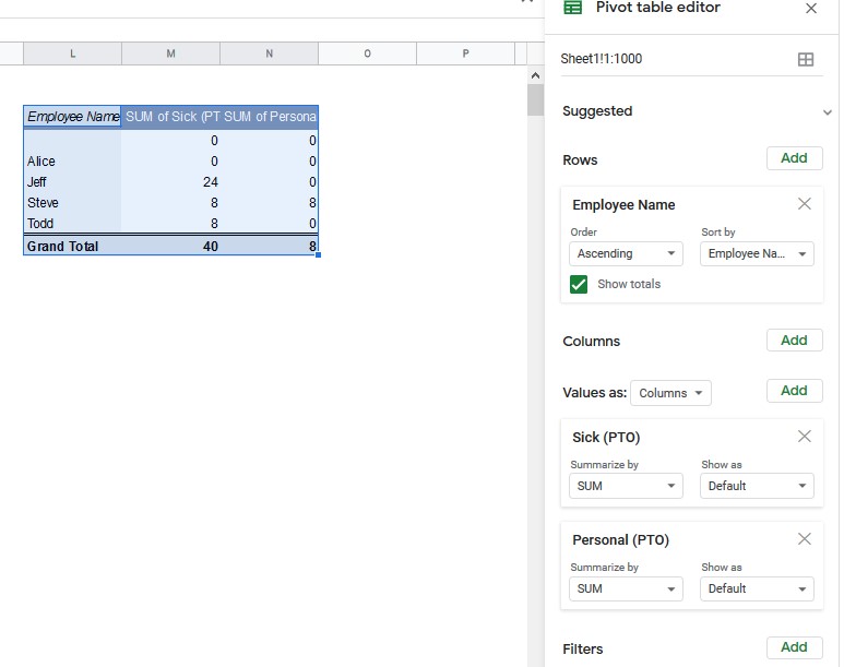
The Google Sheets Results
You did it using Google Sheets! You can quickly see now that Steve used 8 hours of sick time and 8 hours of personal over the period. Todd used 8 sick hours, and Jeff used 24 sick hours. The entire team used 40 hours of “Sick (PTO)” and 8 hours of “Personal (PTO)” over the two week pay period. No wonder it seems like staffing is an issue lately!
Next Steps
Try adding additional headings to “Rows” and “Values” to see what other types of useful reports you can generate. Or, repeat the steps using other fields to have multiple different reports in one file.
Read more content like this
Check out the other posts we have written related to this article.